The sweet Julia from
Nailtopia sent me some gorgeous Easter stickers a while ago, and I wanted to show you a design I did with them!
First I'd like to tell you a little about Nailtopia. I was curious as to how she worked with the Japanese companies - where they were designed for instance! I prefer quoting, as I don't like rephrasing other peoples words, I hope you find it as informative as I did :)
How did you end up selling Nail Stickers?
"I first discovered nail stickers many years ago when a friend of mine went on a business trip to Japan and brought them back for me. I loved them and thought that they would be great to have over here so I set about trying to make contact with the manufacturer. That was the difficult bit! Especially as they don’t speak English and my Japanese can get me as far as ordering some sushi, it was a little difficult to persuade them to start exporting to Europe and manufacturing for me."
Where are the stickers designed?
"Sometimes we design the sticker here, especially if we have a client who wants a bespoke nail sticker design. For instance, we designed the Breast Cancer Campaign design to help raise money for the Breast Cancer Campaign charity. That was great fun and it was a really popular product! "
"Sometimes we come up with an idea and ask the factory to create the design. This is what happened with the Easter designs – I think the Japanese design really shows in the cuteness of the bunnies in particular! However, most of the designs that we sell are designed in Japan for a worldwide market. I find that they have a great expertise in this and enjoy coming up with new design concepts and new production techniques. I choose the ones I think will be popular over here – I also let the designers know what sort of thing is popular here at the moment to try to influence what they might design next . Or I work with them to produce suitable designs for big events, like the World Cup. At the moment we are working on a Royal Wedding idea!"
How are the stickers made?
"The stickers are made – as you guessed – from rubber. The main factory that I work with in Japan invented the production process many years ago. The stickers are made from a synthetic latex and the process (which is top secret!) is more like moulding than printing. It’s also quite labour intensive as it’s a really manual process. "
I also want to add that Julia were very concerned about the factories in Japan during theearthquakes - Thankfully, all the workers were fine, continuing to work despite all the things they've been through!
Here are the Easter Stickers I received for review:
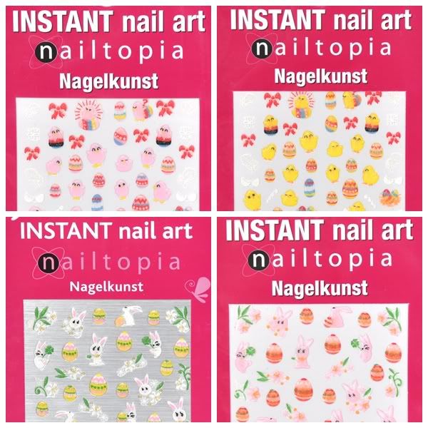 |
| Nailtopia Nail Art Stickers - Easter |
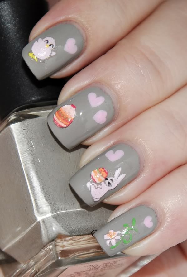
I think they're incredibly adorable! I couldn't choose which to start with, so I used the two pink sheets, which compliment each other rather great in my opinion.
I know there's still a month or so until Easter is upon us, but I wanted to get this review out there in time for you to see if you'd want them, and still have time to order them :)
Also, Easter can be a bit tricky to work with, creating a cute design that is still suitable for work, LOL! It took me a few shots but I think this one turned out pretty cute.
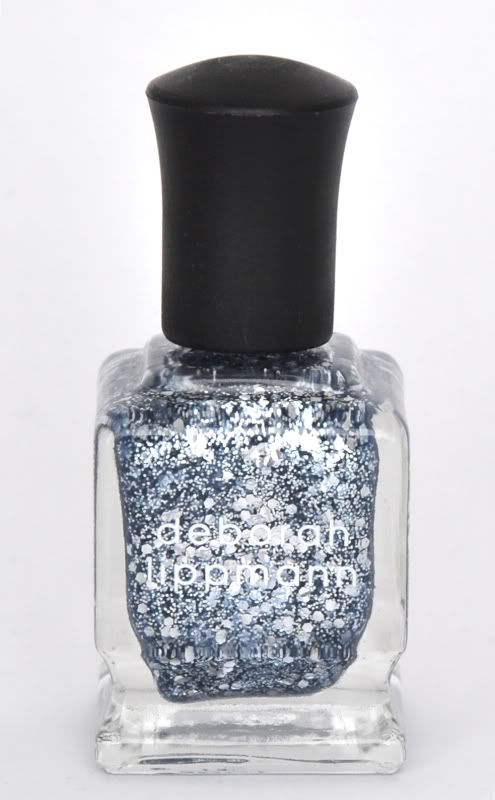
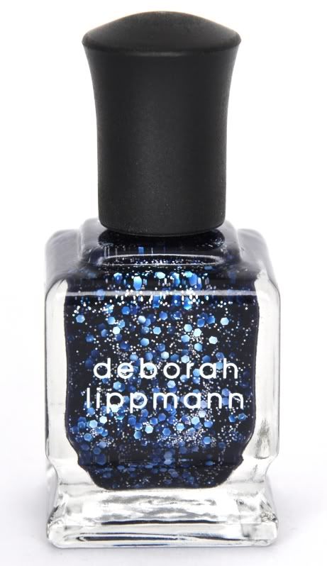
I used one or two coats of Lippmann - Waking Up In Vegas (depending on how it covered in the first coat) and sealed it with China Glaze Fast Forward. I then placed the stickers and drew the hearts with a dotting tool (using China Glaze - Something Sweet) , added another coat of Fast Forward and it was done! It's a really simple design, easy to do if you're short on time or not terribly experienced in nail art.
 |
| Nailtopia Nail Art Stickers - Easter |
The colours are a bit washed out in my picture - the stickers are more vibrant like in the collage I made. They really surprised me when I applied them - see the outlines of the bunny and chicken (arms, legs and the flower petals)? It's see-through, so the base colour shows through as the outline! It's a neat detail a drawing freak like me notice, LOL, but I think it makes them look less cheap and more smooth. It's also a reason these fit with a large range of colours - they will integrate(?) more easy.
I want to thank Julia for providing the information on these adorable stickers as well as providing these for me to review :) I enjoyed playing with them and will definitely be using them this upcoming Easter!
Do you like the design I came up with? What's your opinion on Easter design for nails - is it as fun as Christmas nails, or don't you bother with either? ;)
♥ Vetten