lørdag den 30. april 2011

Catrice : Enter Wonderland

Mandy, a very sweet nailblogger from the Netherlands is my Catrice, Essence and P2 dealer, LOL! She's kindly helped me get quite a few polishes from the new collections, so a big thank you! is in order :) 

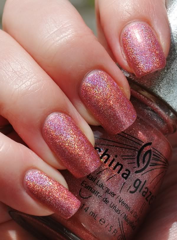
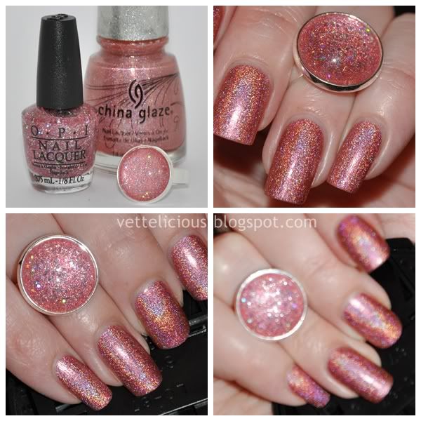
Today I have swatches of a relatively new collection from Catrice, called "Enter Wonderland". Me, being a total Catrice fanatic, had to get all of the colours, after all, they're cheap and in general of a very good quality - if you haven't tried Catrice yet, compare the quality to Gosh - only with a much, much better price and brush. The brush is wider than China Glaze but more narrow than OPI.

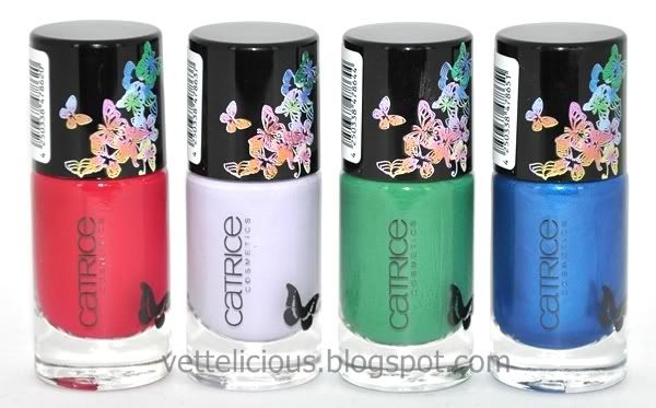
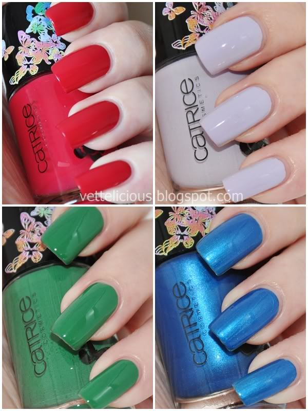
Catrice - Enter Wonderland

#1 - Forbidden Apple is a dark red with some serious pink, almost berry hints. No matter what light I tried, this wouldn't show up right - it's darker, more berry in real life. It had a great formula, borderline jelly, and I used two coats. No topcoat or basecoat.

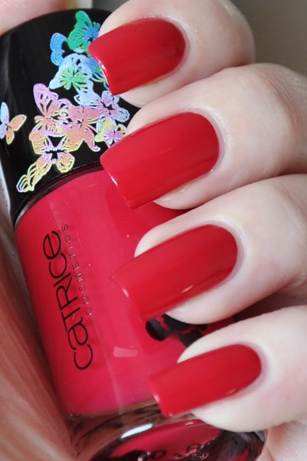
Catrice - Forbidden Apple

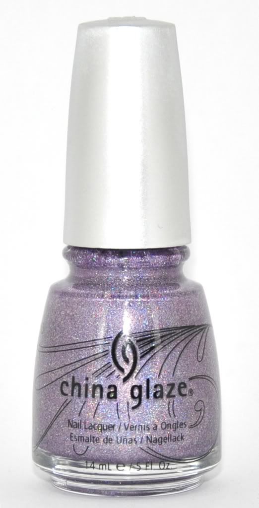
#2 - Lavenderlicious (love the name! LOL, guess why ;) is a very pale lavender creme. I had a few application issues, it was a little hard to even out. It was also sheer, and so I had to use three coats for optimal coverage. The colour is not flattering for my skintone at all. Quite frankly, this is the worst Catrice polish I've tried - I was disappointed to say the least. I expected a perfect creme. Again, no topcoat or basecoat.

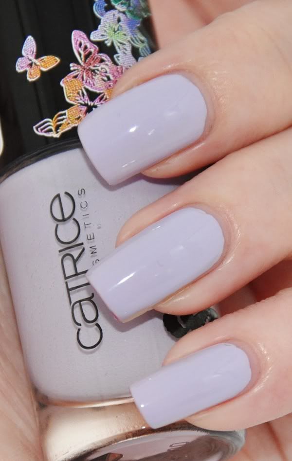
Catrice - Lavenderlicious

#3 - Wonderland Green Card is a green creme that will, if you're a green lover like myself, make you think of Don't Mess With OPI - I haven't compared these yet, but I think they are terribly close. Formula was good and the colour is great, 2 coats. No topcoat or basecoat.

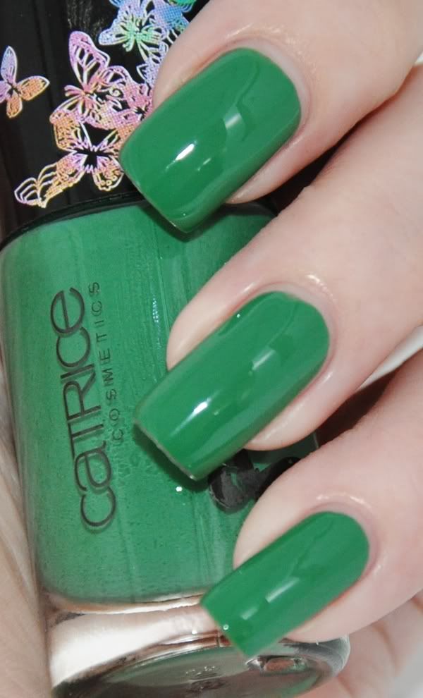
Catrice - Wonderland Green Card

#4 - Miracle Heaven is a frosty shimmer blue. I believe I used three coats for coverage, but this one might be good for layering purposes. It's quite brush-stroke-ish, even more in real life than the pic shows. I added a topcoat on the middle finger to see if I could hide the brush strokes, LOL, you can see how that turned out. While I love the colour, especially on the picture, frosty shimmers just aren't something I wear everyday, so I will have to try different purposes for this one. I have a little voice telling me it'd be amazing with flakies on top, so I will have to try that out!

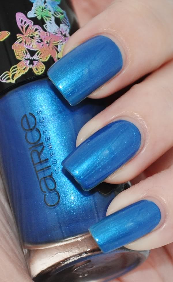
Catrice - Miracle Heaven

While there is nothing unique in this collection, I am loving Forbidden Apple. I don't own many reds and this one is a nice addition! Lavenderlicious is one of those colours you have to love to be willing to make work, and for me, it's not worth it. Wonderland Greencard had a great formula, but I think it's too close to some of my go-to greens - if you don't own anything like it, it's a great and cheap basic green :) It's not its fault that I horde(spelling?) greens as if my life depends on it, lol. Miracle Heaven is too frosty for me, but I hope it'll be good for stamping or other (maybe flakie) purposes... I must admit that the more I look at this colour, the more I like it. It's that darn flakie voice!

In general, this collection is a teeny bit out of place this season IMO - it's far too dark (except Lavenderlicous), and the colours are a bit basic to me. I would have loved to see an orange or funny greenish hue. I hope Catrice is doing a killer collection for Summer. What do you think about this collection?


I have a lot of other new Catrice colours to show you, but alas, I only have two hands so you'll have to be patient on me ;) I promise you that some of them are far more spectacular than these - and if you need proof that Catrice is really worth trying, check out some old swatches I did; Run Forest Run! or Sold Out Forever (which is a great dupe for Chanels much coveted Jade). Catrice is really getting the hang of hidden shimmers, but that's a story for another day. Oh, and I feel like I should mention that the quirks of application on some of these are only annoying compared to other Catrice polishes - like I mentioned previously, it's such a great brand, and I guess I'm acting like a spoiled child right now LOL!

What's your favourite Catrice polish? Is there any of them you would love to own?

♥ Vetten

fredag den 29. april 2011

China Glaze : Papaya Punch

Today I have something really funky to show you. I believe this is the first time - ever - I've worn bright orange nail lacquer. It's quite a big thing for me, can't you tell? :) If you notice my nails are a bit shorter, it's because I filed my nails due to a break. I must admit I love this length! So much easier to handle and paint ♥

Papaya Punch
Island Escape is a new collection from China Glaze for Spring 2011. When the first promo pictures were shown, I was, quite frankly, not excited. I was expecting all polishes to be sheer, and the only positive thing I could find was that I could skip it and focus on other wants. 

That was until I saw the first swatches... I fell in love with Papaya Punch, a bright orange borderline to neon. I must admit that my initial neon craze last year came to an end when I got a pink neon - I was satisfied and went onto other obsessions. I'm getting slightly obsessed with them again, so I allowed myself to invest in a few fun colours for Spring/Summer, and of course, Papaya Punch was the first to be bought :)

I know Papaya Punch is not a neon, but in my world it might as well be. I feel its colour is too bright for a creme, so I shall call it a creme with neon tendencies. It does dry with a gloss, though!

The best thing about Papaya Punch is the coverage. Two medium to thick coats and you're done... China Glaze deserves a huge applause for this ♥

China Glaze Papaya Punch - flash

I'm wearing NailTek II, two coats of Papaya Punch and Fast Forward. This manicure is a total win in my book... I can't stop staring at my nails. I hope it'll be the first of many oranges in my collection! 

I know the general craze is about yellow this year, but if you ask me, it's all about orange. I might as well enjoy it and use the opportunity to buy a few more for Summer mani/pedis ;) What's your opinion on orange - and yellow for that matter?

♥ Vetten

onsdag den 27. april 2011

Nfu Oh #62 + China Glaze Visit Me In Prism

Easter has been amazing here, the weather has been warm, sunny and we've had lots of small barbecues, super yummy!

Nfu Oh #62, sunlight
As for most of nail polish fanatics, a sunny day calls for something sparkly in my stash... Since I still have holos I haven't tried yet, I decided to try one; my very first holo from Nfu Oh - #62. It's a nude/champagne holo with a strong pink tone, very warm and flattering if a silver holo like Gosh Holographic makes your fingers go lobstery.

I tried it using two base coats; NailTek II Foundation and Gosh Fix Base Coat... and the difference was enormous. 

Applied on NailTek II, it was a nightmare I've never tried before - bald patches, pulls, you name it. It took me three coats and as few strokes as humanly possible for it to look decent.

On Fix Base Coat, however, it behaved a lot better. Two coats was enough, and I could be a bit sloppier as usual applying them, LOL! Promise me you'll invest in this basecoat or Nfu Oh's Aqua Base Coat if you try these super dense holos - it'll save you layers, trouble and annoyance! I can't emphasize this enough ;)


Here's a few pictures of #62 shining in the sun;

Nfu Oh #62, sunlight

Even though it's amazing, it's kind of dull inside. The nude colour make my nails look invisible, lol. Not so fond of these super-fine-particle-holos for everyday use :/ I spend too much time inside.

I decided to knock it up a notch with another similar holo, China Glaze's much coveted Visit Me In Prism. This polish was a total lemming for me, it's my ultimate favourite from the Kaleidoscope collection. A big plus in these are that their rough particles rocks inside too! :) I used one coat on top of #62. It's a shame I forgot to take pictures outside of this combo, it looks less phony/grainy IRL. My flash is trying to kill it, lol.

Nfu Oh #62 + Visit Me In Prism, indoors, flash

I'd better show the ring I made as well;


I love the combo!! Visit Me In Prism is quite sheer on its own I believe, so this huge bottle of Nfu Oh serves well as base, lol! Don't feel sorry for #62, it'll get the love it deserves on days I need something neutral for a day outside ;)

♥ Vetten

mandag den 25. april 2011

Swatch Party #1: Untried Gosh Lacquers

Gosh polishes were on sale recently - buy one get one free! I, of course, had to take advantage of the offer LOL. I realised I have so many Gosh polishes that I haven't even tried - most of them from previous sales. So, I decided to pull out a few and swatch!

From left to right: Lavender Love (LE), Flamingo, Pink Lady(DC) & Yellow Doll (LE).


Let's start with Lavender Love, a new colour released for Spring 2011. How this got onto the regular sales display already, I have no idea (neither did the sales staff), but I'm thrilled it did! It's a gorgeous periwinkle blue / purple - in my pictures it's way too blue, but it's impossible to picture correctly.

I used 1-1½ coat - that's right, it's a one coater if you're careful while applying (and undoubtedly if you have shorter nails)! Way to go, Gosh, the world needs more one coaters! This is the second colour I try from this collection, and both have been one coat, gorgeous looking wonders!

Gosh LE Lavender Love

Up next is Flamingo, a gorgeous soft pink. It's been a part of the regular collection for quite some time but it wasn't until this sale I decided to get it. I was afraid it would be very sheer, but I was so wrong! I want to say it's a jelly, because it really feels like one - but at the same time it's nearly opaque in two coats, so maybe it's a jelly creme? Regardless, I love it! It fits my skintone perfectly, and it feels like wearing jelly on your nails. A very pleasant surprise!

Wearing two coats in this picture. I couldn't really capture the jellyness, but trust me... It's worth a try if you want pink without the heavy feel most pink gives you!

Gosh Flamingo

Next is a dark reddish pink with purple shimmer - Pink Lady. I got this a while ago in a sale, I'm pretty sure it was reduced because it is discontinued. Let me be honest, I didn't think I would like this shade at all, because it has a red undertone and it's a dark pink... But I was wrong. I love it! It looks so incredible in the sun and once again, perfect formula. 

I used two coats and it was a dream to apply (in my opinion, shimmers are hard to find with a decent formula compared to cremes - or maybe I've just had bad luck).

Gosh Pink Lady

Now, this one deserves a picture taken outside as well! See how it becomes almost coral? If I ever find an extra bottle of this, I will be a happy camper!

Gosh Pink Lady - outside, direct sun

Last is my little problem child.. LOL! I guess not all could be perfect ;) Yellow doll was part of the 2010 Fall collection, 3 pastels that I'd rather believe is best suited for Spring. Yellow doll looks like a cool/cold yellow in the bottle, but my warmer looking fingers makes it look like a warm pastel yellow. It took me 3 coats to cover up my nail line to the fact that I would wear it, but it was still visible in some kinds of light. 

At least it's not a chalky, thick pastel ;) It is, however, a yellow creme I could see myself wearing - it doesn't turn my fingers into lobstery coloured monsters, lol. Yellow is just not a colour I wear that much.

Gosh - LE Yellow Doll
That's all I have for you today... What do you think about the lacquers? Which is your favourite of the four I've showed you?


Most important of all: would you like posts like this in the future? Granted, it's not going to be swatches of the newest collections - first of all, I can't compete (nor do I want) with all the amazing lacquerheads out there showing us the newest trends, I don't get my hands on them until they've been out for a while anyway, LOL!, and second of all, I don't buy complete collections unless they all appeal to me (which is rare with collections consisting of 6 or more). It would be random untrieds from my stash instead, some still available, some not. Let me know in the comments! :)

I admit I had quite a lot of fun with these, especially with two of them being much better than I thought! Trying colours for fun will help me use them in the future ;)

♥ Vetten

fredag den 22. april 2011

Easter Drawing

Unfortunately I don't have any Easter nails to show you... The weather has been amazing and I've been slacking big time, LOL! Nfu Oh #40 is holding up great, no chips yet, so I don't really see the need in changing it before I get tired of it.

Anyhow, instead of posting an old swatch today, I figured it wouldn't hurt to show what I've spent a few hours on - a drawing! It's nail polish inspired, lol!

Easter Drawing 2011
I guess this is how I picture all nail fanatics out there, LOL! I hope I'm not the only one with a tendency to gaze at my nails ;) It's far from perfect, but it was fun to practise drawing hands. I wish I could show you the colours in real life, they are much better blended. Oh well.. I hope it isn't an eyesore on your daily blog-checking-routine ;)

Have a great weekend!

♥ Vetten

onsdag den 20. april 2011

Nfu Oh #40

I caved and bought a few more flakies from Nfu Oh. When I think about it, most of the manicures I wear for more than a few days have been flakies, and it's no surprise it's one of my favourite effects, is it? :)

One of the ones that made it into my online cart was #40. It's a clear based flakie, and it's definitely meant for layering.

I used NailTek II, one coat WnW Black Creme, one coat #40 and Fast Forward topcoat. It's a painless, yet amazing manicure, lol. Nfu Oh is definitely my go-to's when I need something simple that still looks like a million.

One of the things I love about Nfu Oh's flakies is that not two are alike. This one might look similar to #52 (which I swatched here), but trust me; these are very different. While #52 is in a blue jelly base with shimmer, #40 is flakies only - and the result on the same basecolour is pretty obvious, isn't it? They are very different!

Once again, I decided to skip the bottle picture, because this colour is not much on its own (while the bottle itself is gorgeous, I've shown it so many times I don't think I need to again LOL).

Enjoy the pics of this beauty! :)

Nfu Oh #40

Nfu Oh #40

If I had to choose between #40 and #52, I think I'd go for this one. The clear base means it can be used on every colour of the rainbow, and the flakies look much more crisp and clear in this one as well. That said, I wouldn't give up on #52 - it's got a little more *pow* in it, shimmer and all ♥ Who am I kidding, I can't choose between these, LOL!

Which is your favourite? Do you own either of them?


♥ Vetten

mandag den 18. april 2011

Gosh : Groovy Grey (meet my new love!)

Today I'll be showing one of my latest purchases! 

I've been eagerly waiting for Gosh to get a Spring/Summer display up, and last week my nearest drugstore had the new laqcuers in! They don't have a display, though, which I find a bit odd, they were tucked in with the regular display. It is incredibly hard to find anything about this collection, so I don't have much to tell about it. I found a picture on Google and I assume it's a stock photo, but if you took it, LMK so I can credit you or remove as you please

Image found on Google
The new collection consists of four shades:

# Neon Baby
# Lavender Love
# Misty Mauve
# Groovy Grey

I recently bought Lavender Love which I'll be showing in a swatch party post in a few days ( swatching is fun, though editing takes time, lol), and Groovy Grey - while the two pinks looked sweet and fresh, as of now I don't feel the need to buy them (these are approx. 12$ each!). Maybe next time they are BOGO! :)

So, today is all about Groovy Grey. This is, to me, the star of the collection - as soon as I saw it, I thought about buying a back-up, LOL. It's a greige kind of colour - and I know you will immediately think of a certain dupe when seeing it, so stay tuned for a comparison!

I used my basecoat, NailTek II, and - make sure you see this - ONE average to thick coat of Groovy Grey - yes, it's a one-coater! Light will shine through your tip at this stage, so if you want it completely opaque, no light what-so-ever to shine through, two coats are needed, but I rarely build to that opaque level. I don't flash my nails directly on top of bright lamps, LOL! As long as my nail line isn't visible, I'm happy.

I decided to take two pictures and combine, since this polish can look warm and cold, depending on the light. In real life, it's closest to the picture on the left, but it was very hard to photograph IMO.

Gosh Groovy Grey - flash (left) & shade (right)
Isn't it beautiful? This is, without doubt, a perfect neutral colour ♥ I can see myself wearing this a lot! It'll be perfect for when I need a break from fancy, bright colours and darks ♥

Now, if you made it this far without thinking of Lippmann - Waking Up In Vegas, huge applause, LOL! I decided to do a comparison since I bet a few of you are interested.. Or so I hope, anyway ;) I also included another favourite of mine, H&M's Happy Grey. This one contains shimmer, so it's not a dupe, but colourwise, I was interested in seeing them side by side.

The three lacquers side by side..

Lippmann Vegas, Gosh Groovy Grey, H&M Happy Grey
And swatches on my nailwheel:

Lippmann Vegas, Gosh Groovy Grey, H&M Happy Grey
Close, yet so different! I think the small differences make a huge difference comparing to one's skin tone. Don't mind the stripes in the nails, it's the lightbox + flash that created them. As much as I love Lippmann's, I think Groovy Grey won me over for Spring.. It feels a little less thick/heavy on the nails, so to say, and the colour is a bit warmer too. Happy Grey is a pearl in my collection as well, since the shimmer is incredibly cute. All in all I'm a huge fan of these :)

What do you think about Gosh's new collection? Do you own either of the above mentioned greige polishes? If you own similar colours, let me know as well since I want more of these neutrals! :D

♥ Vetten

søndag den 17. april 2011

Toma : Pistachio Cream (review)

Following my previous post, today I want to show you the second colour Mad Beauty sent to me for review - Pistachio Cream!

As mentioned in my previous post, Toma Nail polish is produced and sold by Mad Beauty Ltd in the UK. You can buy their nail polish from Nailtopia, at the price of roughly 6£ excl. tax.

Toma nail polish comes in bottles of 13.31 ml and I quite like the bottle - it's heavy and of nice quality. One thing I do like to mention is that it's 3-Free and not tested on animals, but it does contain Formaldehyde Resin, so it's not 4-Free. The smell of it was not overwhelming, neither was it particularly pleasant (as nail polish rarely is).

Pistachio Cream is part of Toma's Tutti Frutti collection released for Spring 2011, all of them appears to be as juicy as Pistachio.

I was worried Pistachio Cream would be a sheer, runny mess, but I was very surprised when I tried it and it proved to be covering in two coats. A small warning, though; don't apply the coats too fast after each other or you'll end up with bubbles like I did on my right hand (not pictured, lol). It did not bubble on my left hand, as I waited until each coat was dry.

As always, I used my basecoat, NailTek II as base. Whether the colour stains, I don't know - my nails are yellow as it is. I always recommend a base coat, especially when dealing with greens and blues. I'm not wearing topcoat in these pictures.

Pistachio gives an impression of being slightly jelly-ish - it's far from chalky, which is a huge plus in my book!

Toma - Pistachio Cream -inside, flash

Once again, I decided to snap a picture outside as well!

Toma - Pistachio Cream - sunlight

I know what most of you think when you see a mint green: don't I have enough already? Well, if you're anything like me, LOL, you have to have them all! And I was really surprised to see that Pistachio Cream isn't just your average mint green. It's similar to Barry M's mint green and Nicole by OPI's Lifesaver, but it looks slightly greener and more POW! than these. I'm super thrilled I have it as it looks amazing with my skintone! LMK if you want a comparison ;)

♥ Vetten

(The product in this post was provided for review)

fredag den 15. april 2011

Toma : Prima Donna (review)

Hey everyone! Hope you're having a good week so far :)

Prima Donna
Today I have a dark, vampy colour to show you. I received 2 Toma nail polishes for review with the help of Julia from Nailtopia. I have never tried this brand before, so I was really excited to be given the opportunity of reviewing these!

Toma Nail polish is produced and sold by Mad Beauty Ltd in the UK. You can buy their nail polish from Nailtopia, at the price of roughly 6£ excl. tax.

Toma nail polish comes in bottles of 13.31 ml and I quite like the bottle - it's heavy and of nice quality. One thing I do like to mention is that it's 3-Free and not tested on animals, but it does contain Formaldehyde Resin, so it's not 4-Free. The smell of it was not overwhelming, neither was it particularly pleasant (as nail polish rarely is).

Prima Donna consists of a black jelly base with loads of red microglitter. The brush was very good, perfect for my nails and I had very little clean-up work to do. 

I used my regular basecoat, NailTek II and 3 coats of Prima Donna. I was expecting to use more than two, but if you have shorter nails and are a little more careful/use thicker coats, I'm sure you can get away with two. Another idea would be to use a black creme as base colour, as I often do - but I wanted to show you this gorgeous colour on it's own for this review ;)

I decided to take a picture outside as well - this polish really glows in the sunlight! All of the glitter from the first layers shines through the jelly base, making it deep and gorgeous to look at ♥

Inside:

Toma - Prima Donna - inside, flash

Outside:

Toma - Prima Donna - outside, sunlight

While the colour is not unique, I absolutely love it. I haven't tried China Glaze - Lubu Heels, so I don't know how they compare, but I own and have worn Eyeko Vampira and while they're very similar, I think there's just a little more glitter in Prima Donna. It would make sense, since Vampira covers after two coats and PD needs three. If I were to choose, I'd go for Prima Donna since the brush is so nice to work with - and the price is very nice, too!

I'm very satisfied with my first experience with this brand. I tend to be rather picky about the details - and the only thing I can put my finger on is that it contains Formaldehyde resin, which isn't an ingredient I steer clear of anyway. This is definitely a brand I'll be keeping an eye on for future releases!

♥ Vetten


(The product in this post was provided for review by MAD Beauy, UK)

torsdag den 14. april 2011

Catherine Arley #668

First, let me thank all of you who responded to my last post :) I'm super grateful you like it the way it is, and I will try to include more pictures every now and then to knock it up a notch! 

Lately, the sun has been shining a lot ♥ Yep, I have another holo to show you! :)

Catherine Arley #668 - or, as I call it, Meowth! (Pokemon inspired, as always with these unnamed CA's).

Catherine Arley #668 - inside, flash
Meowth is a medium tan kind of colour. I'm certainly no expert on these shades, but I say for sure that it's a lot browner than my skintone (I'm so pale I blind people! LOL). While I don't think it suits my skintone when it's not flashing rainbow particles (no colour can look unattractive while mimicking the rainbow, I'm that easy to please!), I did enjoy wearing a neutral colour. Maybe I'm just not used to this sort of shade?

I used NailTek II, two coats of Meowth and Fast Forward. It's still rather sheer, but it was acceptable at that point. Expect three coats or even four if you want complete coverage!

Catherine Arley #668 - inside, flash
And since I received Spin Me Round from the Kaleidoscope collection while wearing this, I decided to do a comparison for you!

As shown:
- Meowth
- Spin Me Round
- Meowth

Catherine Arley #668 & Spin Me Round, sunlight

While the difference is not that easy to spot in pics, I think Meowth is very different IRL. It has much more fine particles, but they share the same kind of holographic effect - linear, but still scattered. My favourite? While they're very different, I'll be reaching for Spin Me Round next time, as I love the rough holos ;)

Which do you like the most - if any? Do you have either, or do you want them? What's your opinion about subtle colours as holos - yay or nay?

♥ Vetten

tirsdag den 12. april 2011

China Glaze : Octa Gone Wild (+ring!)

(I'm not good at updating these days and I'll tell you why: migraine. I found a recent NOTD post I wrote last week but didn't have the time to post. Hope you don't mind!)

Time to show another glorious holographic polishes from China Glazes best collection ever - Kaleidoscope. This time you can feast your eyes on the wonder that's called Octa Gone Wild, a gorgeous linear purple. 

In the bottle, most Kaleidoscope polishes looks like a dull glitter, but fear not: once applied they will show off, even in dull light!

Yep, I'm a huge fan of these. I can't find anything wrong with them. They're quite covering, 2 coats doing the trick if you can survive a little visible nail line (and I can since it's only when the light is hitting it right), and the best part? They show their holo goodness inside, even with very low light. That's one thing I prioritize in a holo polish!


I'm wearing one coat of Nail Tek II, two coats of Octa Gone Wild, and I hadn't put on topcoat on all the pictures... I was afraid it would dull the effect, so I took a few pics before using it, and a few after... and the result was the same. 
The pics with ring is with topcoat and the ones without is a mix, I think. 


I wore this colour for 3 days without chips, just very minor tipwear. For any lacquerhead, that's a while, right?! LOL


Instead of wasting your time reading my boring opinion, let's skip ahead to what really matter... Picspam!

China Glaze Octa Gone Wild

China Glaze Octa Gone Wild

China Glaze Octa Gone Wild

For once, I decided to go nuts with pictures. Recently, I've begun to think about the appearance of my posts - is it getting to the point where I blabber on about boring details and not showing enough pictures? LMK in the comments, I appreciate your honesty on this matter.. I don't want to bore you to death! :)

I cheated a little... You might not notice it, but the ring is not made with Octa. It's OPI DS Original, a polish which I have yet the pleasure of wearing (saving it for another sunny day). But I think it suited the mani quite nicely anyway ;)

♥ Vetten

søndag den 10. april 2011

Gosh : Holographic

Gosh is one of few Danish make up companies. For as long as I can remember, I've been drooling over their stands in drugstores, always looking at their nail polish. They've always carried exciting, different colours, far away from safe reds and nude pinks. Before I realized I was becoming a nail polish addict, I had a few of their polishes - and it was amongst my favourites. Before this turns into a patriotic post sounding like a commercial, LOL, let focus on what this post is really about - my point being that Gosh is a widely known brand within the nail polish community... And much of it is because of one of their most adored polishes. If there's one polish Gosh is known for, it's Holographic.

In the bottle, Holographic looks like a silver polish - and that's what I thought it was until I looked up swatches when I started getting into nail polish. Then I had an OMG moment and rushed to the stores the day after, LOL! 

Now, it will be a bit of a problem child if you're cheap and don't invest in a good base coat - I conveniently bought the Fix Base Coat from Gosh when their lacquers where 40% off. Gosh even added a sticker to Holographic advising people to use the right base coat. And no, it really isn't just a sales trick trying to get you to invest more money in their products - it will save you many tears and even coats of Holographic.

Fix Base Coat is slow drying, but it's worth it. It dries with what I'd say is a "good-gripping" feel to it. I failed while swatching this; apparently I didn't even out the layer on my ring finger, so the weird blob you can see on my pictures is because of that. I recommend thin coats ;) I used two coats of Holographic, and no topcoat - it dries really fast.

I had a few issues photographing this wonder - in my lightbox, the flash washes out the holo effect, and without, it's back to looking plain silver. I therefore went outside, and although there's a lot of better pictures out there, I think I got a few decent shots (it will be a quest of mine to photograph this properly one day), at least it's better than a post without pictures, right?

Gosh Holographic - direct sunlight

Isn't it amazing? The only downside is the dullness inside - which is the reason I'm not wearing this more often. I'm looking forward to be using this in the Summer, being outside most of the day blogging in the shadow.. I'm sure this will keep me good company those days ♥

I contacted Gosh through their danish website, and the rumour is true.. It's discontinued. I'm proud to say, almost a bit embarrassed even, that I emptied all the shops around me while they were on sale. Can you blame me for wanting back-ups? :)

Oh, while I were contacting them, I asked them if they were planning to release new holographic polishes, but sadly, there's no plans about this right now. I'm in the mood to start a petition, LOL! Wouldn't it be amazing to see a dark blue, purple, even green holographic polish? While I accept the effect will be lessened when you add colour to the mix, it would be worth it!


♥ Vetten

lørdag den 9. april 2011

Shattered Candy - OPI / China Glaze crackle mani

Let me start this post by saying that I'm definitely not fed up with crackles just yet. For me, crackle polishes are here to stay. It's a "new" type of finish, just like I'm still loving matte manicures, suede finish, you name it. I just wear whatever floats my boat, LOL!

I recently made a bunch of crackle rings, and I decided to match my manicure to one of them. I'm wearing four polishes: China Glaze For Audrey with OPI's Black Shatter and Wet'n'Wild Black Creme with China Glaze Crushed Candy.

It took me one, thick coat to mostly cover my nails with For Audrey, and Black Creme is a one coater even with a thin-ish coat, so it was a fast manicure overall. I had a few issues getting Crushed Candy to crack right, but I think it's because it has thickened a bit. 

I'm including a picture of both hands, and I must say I like the result on the right hand the most (the picture on the left). Big crackles are so beautiful; it really shows the colour underneath it!

Shattered Candy - OPI / China Glaze crackle

And here's a picture of my right hand with the matching ring :)

Shattered Candy - OPI / China Glaze crackle

That's all I have for you today!

♥ Vetten

tirsdag den 5. april 2011

Gosh - New Age

Today I have an old discontinued colour to show you. I'm sure a lot of us looks for polishes on sale at any time possible. While visiting my local Matas (drugstore) a little while back, I decided to look for discontinued Gosh polishes which are sold at half price. It's almost always the same boring polishes, but every once in a while a new old polish find it's way to the bin in some magic way, lol.

This time I got lucky and found a grubby bottle in their old design. It's called New Age and is a dark green shimmer/pearl polish - even though I don't like pearl finish at all, I decided to give it a chance at half the original price ;) I took it home, cleaned the bottle with acetone (it was full of old, sticky makeup, yuck!) and it ended up looking rather good!

I suspected it to be very sheer (the brush being visible even dripping with polish), so I used a green creme as base for my manicure. I decided to use Don't Mess With Opi, a green creme from the Texas collection earlier this year. One coat was sufficient enough to cover my nails although I would use two if I was going for a manicure with this polish (don't mess, that is) on its own.

I then added a coat of New Age, and even though I believe I skipped the top coat for these pictures, I used it later on to protect the manicure. It was slow drying, lol. Also, I should mention  it was a bit brush-stroke-y, and I realised I should've used another coat of New Age as it showed bald spots in some types of light.

I ended up choosing two pictures to show you - one in my lightbox, showing how it looks like most of the time, and one in sunlight to show you how it comes alive with a few rays of sun. :)

Lightbox:

Gosh - New Age - lightbox

Sunlight:

Gosh - New Age - sunlight
 Do you like it? I think it's pretty neat for an old polish - I don't know exactly how old, but I'd guess at least 3 years or so. I wish I knew when Gosh changed into the new bottles... These are easier to use because of the handles (and they look bigger! lol). When did you last find something old but still neat on a polish hunt? :)

Vetten

søndag den 3. april 2011

China Glaze : Rated Holographic (+ matching ring!)

Today I want to show you my new love. 

China Glaze Rated Holographic
I have no idea why I never gave China Glaze Rated Holographic a chance until now. And truth be told I ordered it in the belief that it would be a rusty, red holographic - which isn't quite right (even though my bottle picture shows it as a hint too red. It's more true to the ring pictures).

Rated is from China Glazes much coveted Kaleidoscope collection. I have quite a few of the colours myself, but I have put off wearing them until the sky clears and I can enjoy them in their full glory. The thing is... Rated is gorgeous even on a cloudy day. Heck, I didn't even mean to be wearing it, I was supposed to swatch a few colours and started with applying Rated on four nails. It quickly made it's way onto the last six, and before I knew it, I was making a ring to match it as well.

I used my regular base coat, NailTek II, 2 coats of Rated and no topcoat this time. It dried really fast and with a satin kind of finish - where have I been living the past months during the holo craze around the blogs? I thought these were rough to the touch! - and so I left it for once and saved a few drops of top coat, LOL!

Why did Rated surprise me so? It is very similar to OPIs Teenage Dream, and I'm surprised I haven't seen any manicures with these two paired in blogland. Come to think of it, Rated is gorgeous on its own and I didn't even want Teenage Dream on top of it except in the ring to give it more bling, so that might explain it.

China Glaze Rated Holographic - outdoors, direct sun
 The above picture shows rated a tad too red, again - it is really more the colour of the following pictures:

China Glaze Rated Holographic - indoors, flash

If you've noticed the vintage worn looking lid on Rated, you're spot on: it isn't the original foil. It's such a silly thing, but when Rated arrived it was covered in Laser Lime (which sadly didn't survive breaking it's neck. Tragedy!) and the silver foil was gone, making the lid looking like yellowed plastic. I love this polish so much that I decided to used a silver foil polish to paint the lid and sealed it with ChG Fast Forward. Yep, I'm very silly like that. I'm a perfectionist in many ways, and I wanted Rated to look as gorgeous (as possible to remake) as the other 7 Kaleidoscope polishes I have.

Do you like this colour? I don't think I need to repeat myself, but I was really surprised when I tried it. It's amazing! I'm already in the process of ordering a spare bottle of this beauty. I must admit that I'm beginning to like the Kaleidoscope holos far better than OMG holos.

On another note, expect to see rings with many of my posts from now on. Initially I wanted to make a post showing them all, but as I'm always making new ones I decided it'd be much more fun to spice up my plain-looking-manicure pictures.

Also, a huge thank you for following ♥ I went online today to see there's a staggering 300 of you now, wow!! Needless to say, I am very flattered you guys follow my nails' life :)

♥ Vetten