Viser opslag med etiketten Catherine Arley. Vis alle opslag

torsdag den 14. april 2011

Catherine Arley #668

First, let me thank all of you who responded to my last post :) I'm super grateful you like it the way it is, and I will try to include more pictures every now and then to knock it up a notch! 

Lately, the sun has been shining a lot ♥ Yep, I have another holo to show you! :)

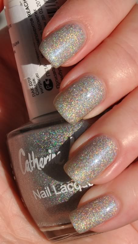
Catherine Arley #668 - or, as I call it, Meowth! (Pokemon inspired, as always with these unnamed CA's).
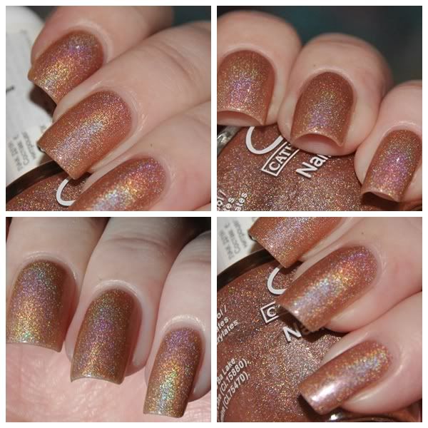
Catherine Arley #668 - inside, flash
Meowth is a medium tan kind of colour. I'm certainly no expert on these shades, but I say for sure that it's a lot browner than my skintone (I'm so pale I blind people! LOL). While I don't think it suits my skintone when it's not flashing rainbow particles (no colour can look unattractive while mimicking the rainbow, I'm that easy to please!), I did enjoy wearing a neutral colour. Maybe I'm just not used to this sort of shade?

I used NailTek II, two coats of Meowth and Fast Forward. It's still rather sheer, but it was acceptable at that point. Expect three coats or even four if you want complete coverage!
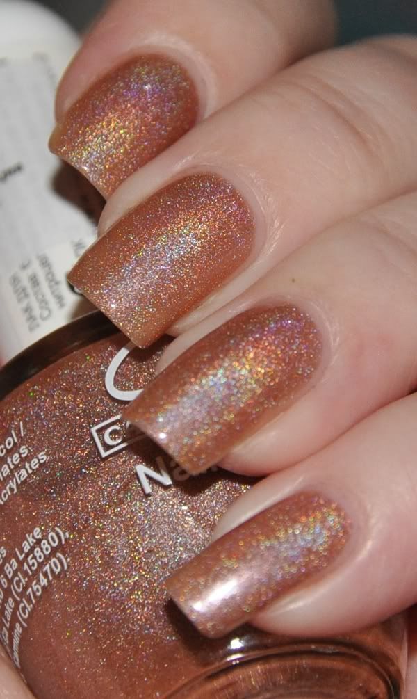
Catherine Arley #668 - inside, flash
And since I received Spin Me Round from the Kaleidoscope collection while wearing this, I decided to do a comparison for you!

As shown:
- Meowth
- Spin Me Round
- Meowth
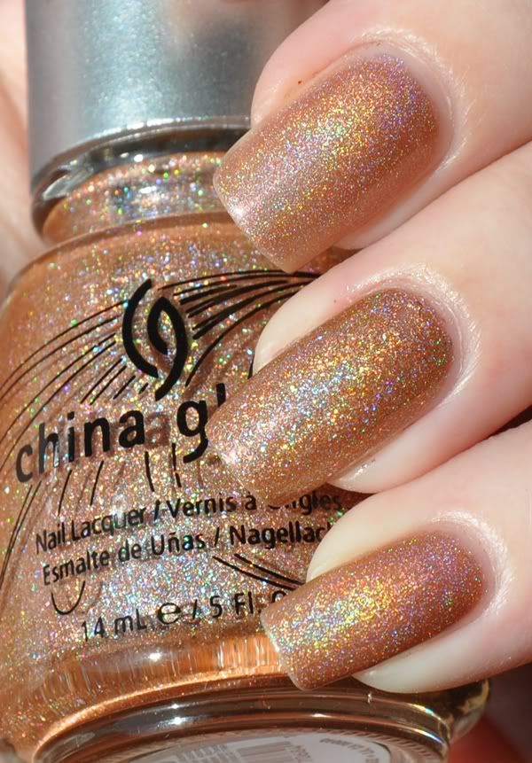
Catherine Arley #668 & Spin Me Round, sunlight

While the difference is not that easy to spot in pics, I think Meowth is very different IRL. It has much more fine particles, but they share the same kind of holographic effect - linear, but still scattered. My favourite? While they're very different, I'll be reaching for Spin Me Round next time, as I love the rough holos ;)

Which do you like the most - if any? Do you have either, or do you want them? What's your opinion about subtle colours as holos - yay or nay?

♥ Vetten

fredag den 18. marts 2011

Catherine Arley #674

I have one of the most holographic Catherine Arley polishes to show you today; #674 :)

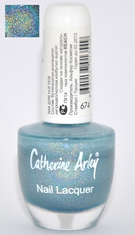
 CA holos doesn't show much holo effect in my lightbox, so I included a tiny macro with my regular bottle shot.

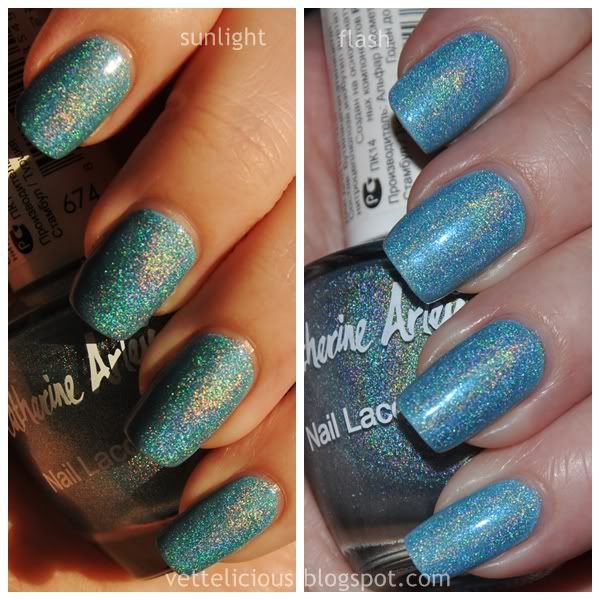
 #674 is a baby blue strong linear holographic polish. I want another name for this pretty right away, so let's refer to it as... Squirtle! Another pokemon name for another number - fair trade, right? :)

As always, I decided to start with a base colour, and this time I used Bahamian Escape from China Glaze, quite an opaque baby blue. It's a warm blue, and perhaps a little too warm for my skintone, so I was hoping Squirtle would be of help. I'm not fond of the red-ish colour it makes my skin appear, but oh well, maybe if I get used to it.

I used one coat of Bahamian, then two coats of Squirtle, one coat of China Glaze Fast Forward and were done!

I did the manicure just in time for the last few rays of sunlight, so I took a picture in both sunlight and with flash to show you. It's pretty obvious which is which, but I wrote it on the pics anyway :) My fingers look wrinkly, I hope you don't mind, LOL! They've been working hard today eating uhm, testing cookies I baked with the help of my boyfriend for his B-day.

Once again, I want to mention how my topcoat did not take one teeny bit of the holographic effect away. Thankfully!

Catherine Arley #674 - Squirtle, as it is named in my collection
I would be curious to see how this one compares to other blue holographics since I don't own other! It's on my wishlist, though (at least the list in my head - I forget to update the real version).

Because Squirtle is sheer, I think I want to test it on darker colours soon - it might be possible to make it even more awesome than a baby blue holo - after all, there are a few of those around. 


♥ Vetten

onsdag den 16. marts 2011

Catherine Arley # 673

Like I mentioned in my previous post, I just can't help but spice a purple creme up - or, as Elzar from Futurama would say - knock it up a notch! (any Futurama lovers out there? I love the Spice weasel! I want to make a franken inspired by it one day ♥)

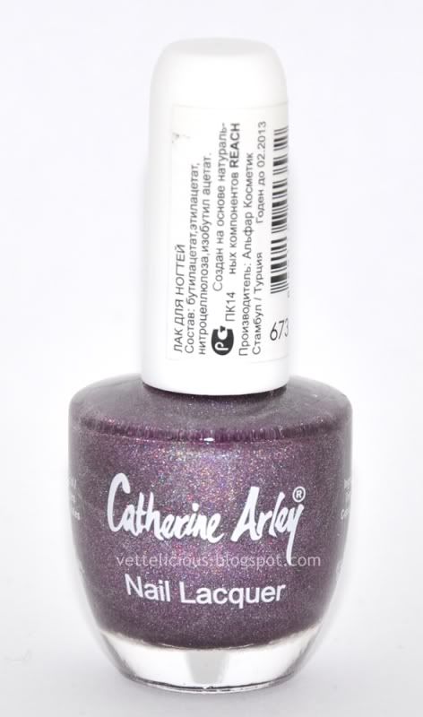
Catherine Arley #673 
Anyway, this time I decided it was time to break the seal on another Catherine Arley holographic - #673.

In the bottle, #673 doesn't show a huge amount of holographic awesomeness, but that sure changes when it's applied!

As if I haven't ranted about this before, let me rant (I'm good at that, LOL) about the lack of good names for Catherine Arley polishes... So, once again, I felt like I had to rename this baby - and it is now called Ghastly. Yep, I found another pokémon as inspiration :)

I used my previous manicure, two coats of OPI Pamplona Purple, as base colour. CA holos are, in general, on the sheer side and I don't think it steals away from they gorgeousness to add a base colour - if anything, it makes them more interesting in the lack of sunlight (and we haven't had any around me for a week or more).  I used one coat of Ghastly, finishing off with a coat of Fast Forward - and it did not take away any of the holographic effect.

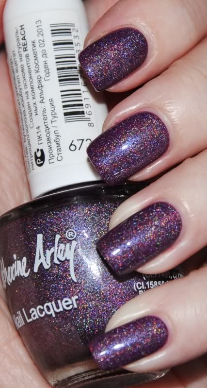
While Pamplona is definitely much too warm a purple compared to Ghastly, I was surprised to find the result to be good looking despite this! I think Ghastly is a pretty decent linear holo, not linear like Nfu Oh holos or OMG holos, but like other rough, linear holos. I will have to try this baby on its own when the sun shows ♥

It ended up looking much like the bottle colour, don't you think? 

Catherine Arley #673 - flash, indoor

Getting tired of seeing Catherine Arley holos, or is it a nice change from the boring Tronica collection? (No disrespect if you like the Tronica collection - after all it does have a few gems, and it's pretty in it's own way - just not very holographic as I hoped for!). As much as I am disappointed in the Tronicas, a few of the colours are speaking to me, so I might get them for stamping purposes.

♥ Vetten

søndag den 13. marts 2011

CA #803 aka Bellsprout vs. L8R G8R - a green holo comparison

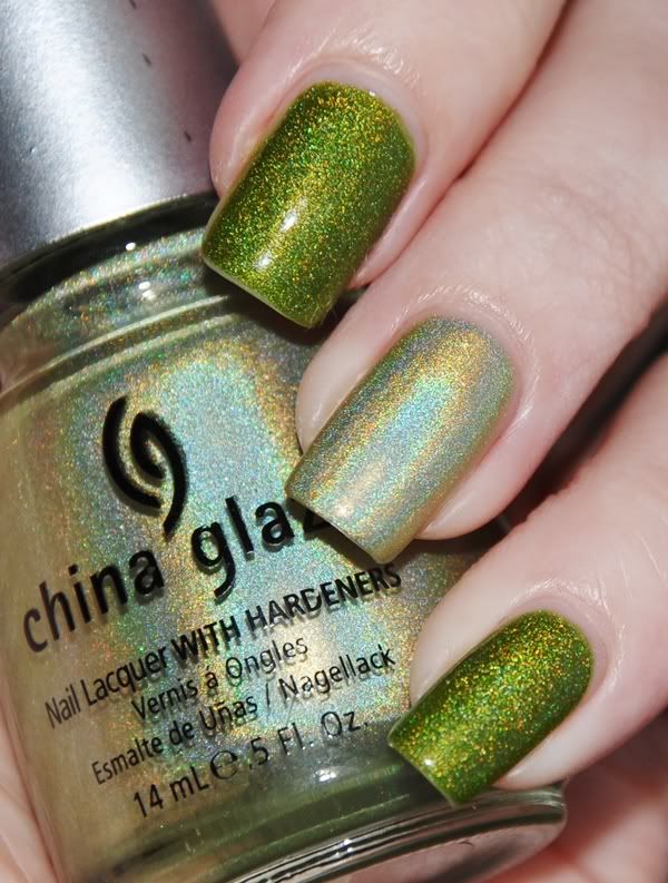
Another excuse to flash Bellsprout again! While no-one asked for a comparison, I did one for myself ;) I was curious to see the two compare.

I used one coat of OPI Greenwich Village and two coats of Bellsprout (CA #803) on my middle and pinky.
On my ring finger I used 2 coats of China Glaze L8R G8R (from the OMG collection).
Catherine Arley #803 vs. China Glaze - L8R G8R
In this picture, I have been wearing Bellsprout for 5 days. Amazing lack of tip wear, eh? I'm beginning to love Catherine Arley holos more and more!

While it's easy to see they're no match, I'm curious to know which of the two you like better. Bellsprout is without doubt my favourite, it goes much better with my skin tone than L8R G8R - but if you go for the most linear holo, L8R G8R is the winner. As for now I'll stick with Bellsprout, but maybe when (if!) I get a little colour on my skin this Summer, I'll try L8R G8R again.

Even though the Tronica collection is like nothing I hoped for, I might be hunting down Laser Lime. While I doubt it'll be no match for Bellsprout, I've come to the conclusion that the base colour of the holo matters more than the effect, and I'm willing to give it a chance :)

♥ Vetten

lørdag den 12. marts 2011

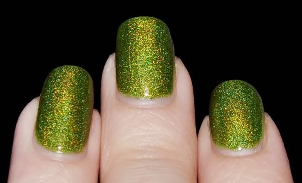
Catherine Arley #803

I can't tell you how much I've been looking forward to Spring. I miss the green sprouts, warmer weather and most of all - sunshine! I have so many holographic polishes I haven't even shown here, because I don't bother wearing them when the sun is hiding - and the last months it has been very sporadic and only a few hours a day at most I've seen the sun. Until Monday, that was!

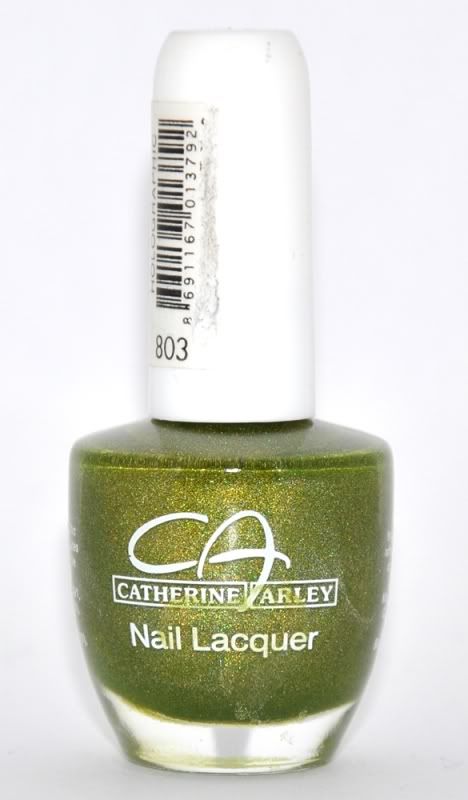
Catherine Arley #803
I went to check out my glass cabinets and #803 sent me green vibes - like a stubborn sprout determined to grow despite the harsh weather - and I went for it. I was very sceptic at first; it's a yellow based green and those don't tend to play well with my skin tone. How very wrong I was!

Let me start by saying that #803 is not a perfect linear holo. It is also not as holo as many other great holos, but it has a gorgeous, spunky colour and that's what won me over. I ordered a back-up of this one along with it, and the CA logo is different - as is the holo effect! I will try the other one next time, and I suspect it is just a tiny bit more holo. Time will tell.

As CA holos has a reputation for being on the sheer side, I decided to find a green creme and use one coat just for good measure. OPI Greenwich Village looked like a good candidate, and so I used one coat. Still not covering my nail lines, I decided to stop anyway - it was only to help #803 a bit. ;) I then proceeded to use two coats of #803, one coat of ChG Fast Forward and I was done!

Excuse the smeared polish on the bottle - I didn't notice until I had already taken all the pictures and it was too late. I'm pretty sure I didn't spill any polish, so it must've been there all the time. Oh well, I'll remove it before next time ;)

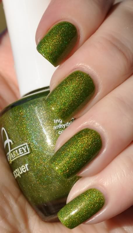
This polish is hard to capture on pictures. I tried all kinds of light and angles, and the holo effect just wouldn't show properly. The last picture shows the most accurate look of the effect.

CA #803 - direct sunlight

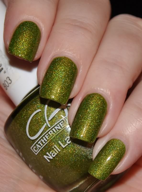
CA #803 - indoor with flash

This picture is taken after 3 days of wear and there's not a single chip nor any tip wear worth mentioning - only growth, and a lot of it! :

CA #803 - indoor with flash
I think we can agree that this colour is amazing, right? It's one of few holographic polishes that I enjoy indoor - if it catches a small beam of light, it looks deep and mesmerizing ♥ ♥ ♥ It's an incredible colour, and even though it's a bit out of my regular choice of green hue, I love it with my skin tone! It doesn't give me lobster hands or yellowed finger tips either. While I love it like a first-born, I can totally understand if it isn't your cup of (green) tea - it's quite the unique holo. Would you like to see a comparison to L8R G8R from China Glaze's OMG collection?

Let me finish by adding that this polish is now named Bellsprout, named after a common Pokémon (yep - I still play! I'm truly a child at heart :P). #803 is far too boring a name for this gorgeousness!

♥ Vetten

søndag den 20. februar 2011

Pssst.. wanna win these? CA holo swatches

As soon as the sun started showing today, I knew I had to do swatches of some of my Catherine Arley polishes. I have a lot of them, but today I'll be showing you two featured in the giveaway - so you know what you're entering to win! :)

CA #676, 3 coats, no topcoat, sunlight. Excuse my lobster-looking hands, it was freezing!

Let's start with #676, a silver holo. I used three coats for this picture, and as you can see it is very sheer. I recommend it as a holo-topcoat, using a silver as base if you want it to look remotely like in the bottle, or just plain use it for frankens! It's always fun to holofy a franken! :)

Next up is #666:

CA #666, two coats, no topcoat, sunlight

Two coats. This is more like it! While it was definitely sheer in indoor-light, I think it could be totally opaque in three coats.

Hope you like the prizes as much as I do! :) Thanks for the huge number of entries and new followers; having a give-away is so much fun (and work, LOL! I write the entries with pen and paper - wish I was more computer savvy!)

♥ Vetten

lørdag den 15. januar 2011

Holo-madness! Catherine Arley #667

Today I'm wearing a holographic pretty I got recently. I bought quite a few Catherine Arley polishes with the help of a sweet Bulgarian :) Catherine Arley is a Turkish brand from what I understand, and each nail polish cost me about 1.50$ . A big thank you to Emerald Sparkled, who showed these beautiful holos on her blog! Without that post I never would've known they existed.

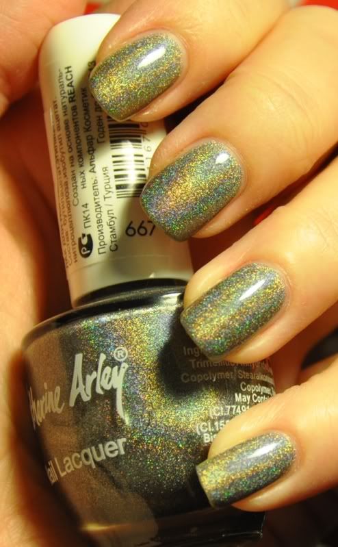
#667 is a dark grey holographic polish a very strong holo effect. In order to show you how pretty this gorgeous polish is without having any kind of natural light, let alone sunlight, I had to play with some artificial light and it made my fingers go red and yellow. Please excuse that, but I'm sure you'll agree that the polish is more important :)  

This picture shows the effect and the density of the holo effect very well, however a bit washed out, the colour is more accurate on the following pictures. I hope I can get better pics during the weekend, if so I will update this post.

Catherine Arley #667 - artificial light, no flash

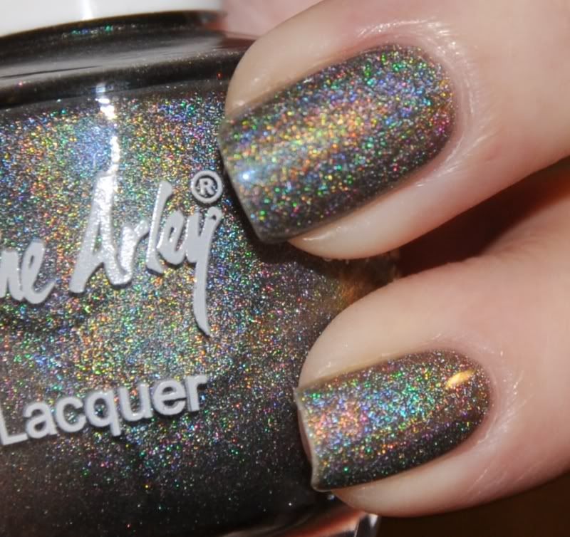
And a close-up (this is the colour the polish is IRL)

Catherine Arley #667 - artificial light, flash

And a blurry pic where you can really see the pretty sparkles!

Catherine Arley #667 - artificial light, flash

I'm wearing two thick coats and one coat of Seche Vite. I found that while the top coat was drying, the holo effect was very muted compared to the nails without, but once it dried fully there was no difference other than the finish, which were more shiny. So there's no need to skip the topcoat on this one ;)

As for how rough the holo glitter particles are, it compares to GOSH - Holographic. It's rougher than OMG holos, but finer than Kaleidoscope holos.

This was one of my fav Catherine Arleys going from the bottles when I received them, and it certainly hasn't disappointed me! The price is unbeatable and the result is... Holo! ♥ It really says it all.

♥ Vettelicious